

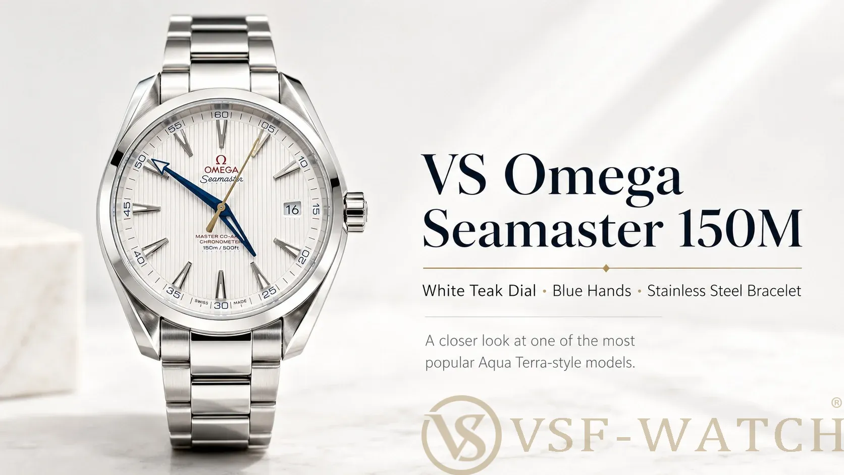
The Aqua Terra 150m is one of those watches where the details matter more than usual. Horizontal teak dial, Co-Axial movement, clean case lines. Standard market versions have been getting the basics wrong for years: wrong movement architecture pushing the case too thick, rough dial grooves, sloppy hand finishing.
VSF Watch version uses an integrated 8500/8900 movement and retooled dial manufacturing. Here's how it compares to the standard market alternatives.
1. Case thickness and movement architecture
The single biggest difference between VSF and standard market versions is the movement. Standard versions use a decorated base movement with cosmetic plates glued on top. Those plates add height, which pushes the case to 13.6mm. Gen is 12.8mm. That 0.8mm difference is visible in the mid-case profile and changes how the watch sits on the wrist.
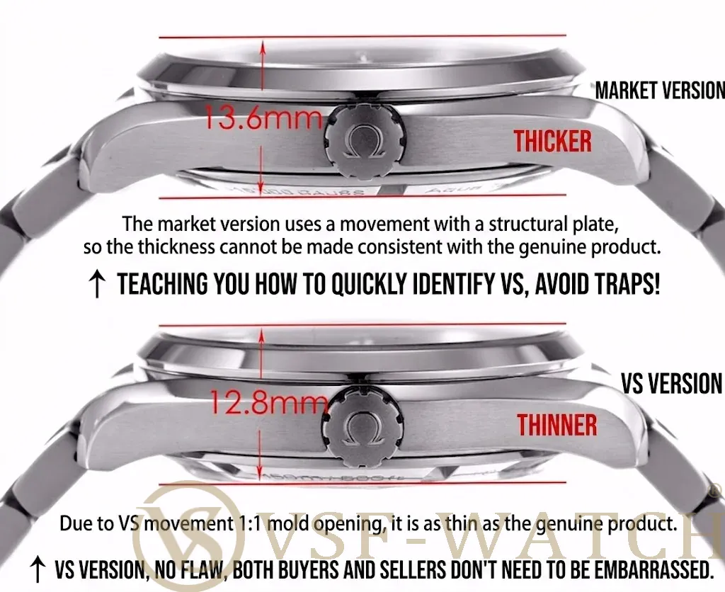
VSF Watch uses an integrated clone movement with no overlay plates. Case thickness measures 12.8mm, matching gen. The watch sits flatter and slips under a cuff the way it should.
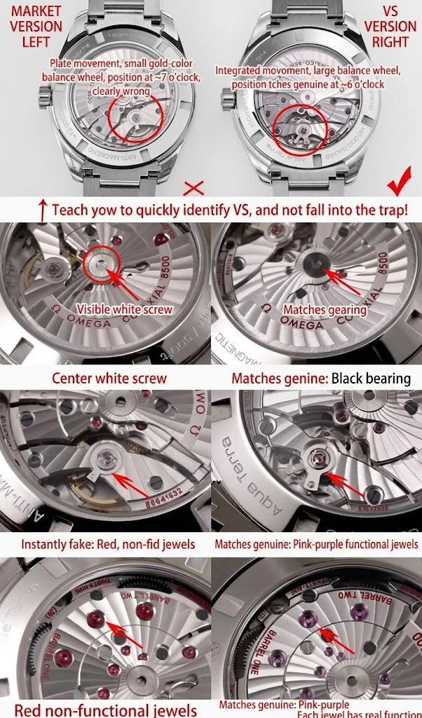
Through the display case back, the movement differences are obvious:
Balance wheel: VSF Watch uses a large black balance wheel at 6 o'clock, matching the gen. Standard versions use a smaller gold balance wheel at 7 o'clock, which is wrong.
Shock absorber: VSF Watch has a functional Nivachoc-style shock unit. Standard versions use a non-functional cosmetic absorber.
Jewels: VSF Watch uses purplish-pink functional jewels and a black center bearing. Standard versions use fake red jewels and an exposed silver screw at the center.
2. Dial: teak grooves, color, and typography
The teak dial is defined by finely spaced vertical grooves. Standard market versions mill the grooves too wide and too rough. The base color leans greyish rather than the warm ivory of gen. VSF's grooves are tighter and more delicate, and the base color is the correct warm ivory tone.
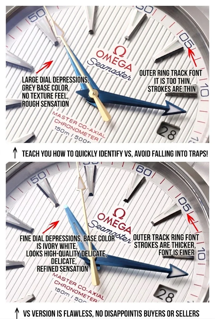
The outer minute track font on standard versions is too thin and looks washed out. VSF matches the bolder, thicker gen typography.
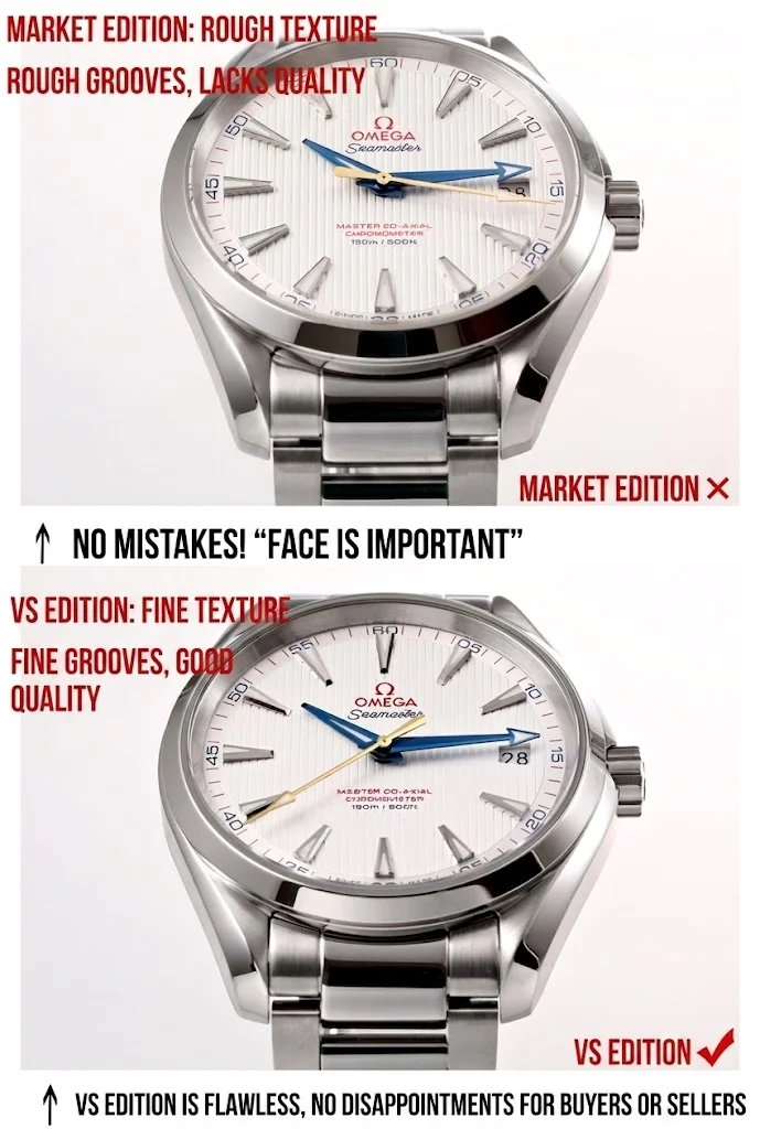
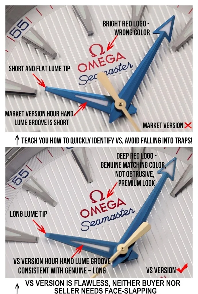
The red "Seamaster" logo: VSF uses a deep, rich red. Standard versions use a bright, almost fluorescent red that stands out as wrong the moment you see it next to gen or the VSF.
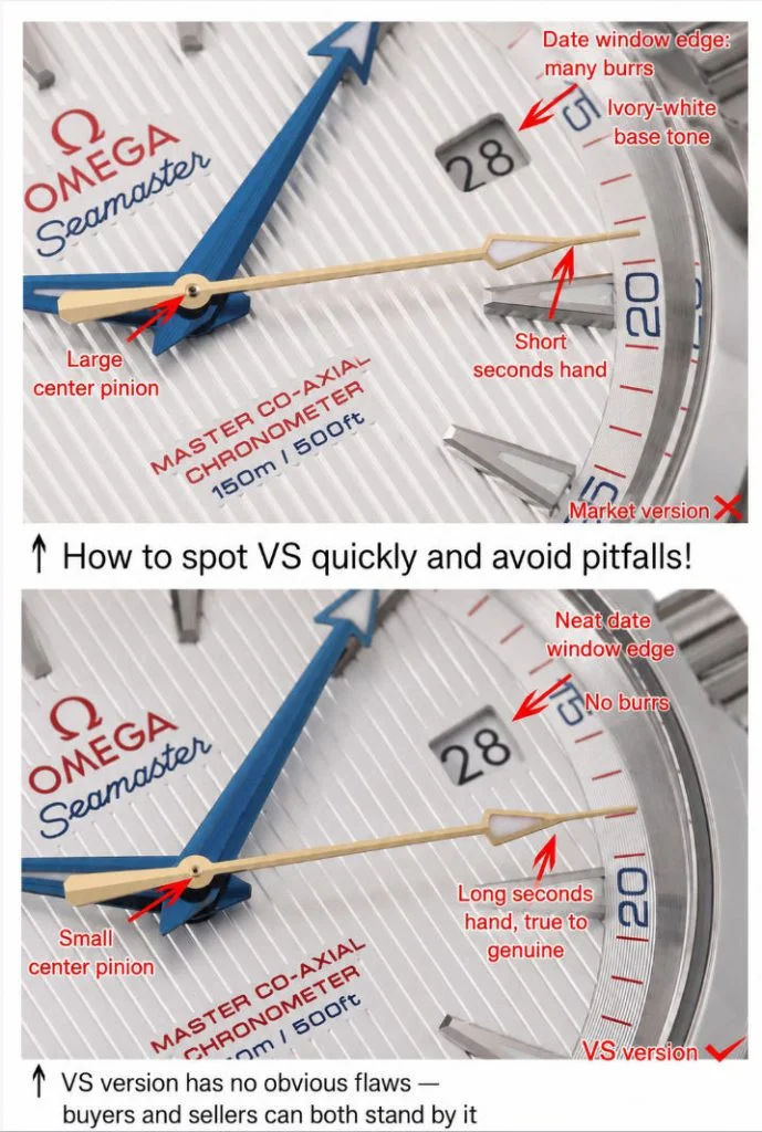
The date window on standard versions often has rough edges or burrs from imprecise cutting. VSF's date window is laser-cut with clean edges.
3. Hand finishing
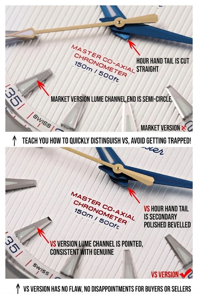
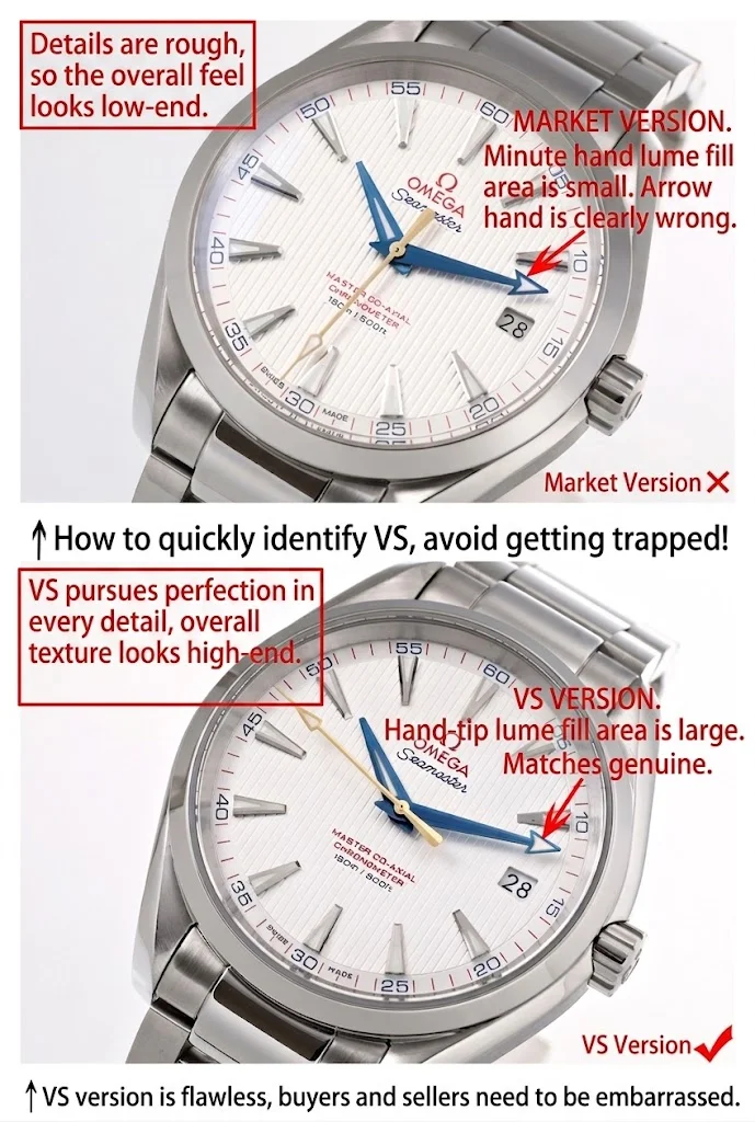
Standard versions cut corners on the hands because they're small and harder to inspect without a loupe. The tells:
The center pinion is oversized on standard versions, making the hand stack look clunky. VSF uses a smaller, correctly sized pinion.
The second hand on standard versions is noticeably too short. VSF's is the correct length.
The hour hand tip is truncated on standard versions; VSF's is properly elongated, and the tail has secondary chamfering rather than a flat cut.
The luminous slot on the hour hand comes to a sharp point on VSF, matching gen. Standard versions round it off into a semicircle.
The minute hand arrow tip has a larger, correctly shaped lume fill on VSF. Standard versions use a smaller, oddly proportioned fill area.
4. Bracelet and clasp
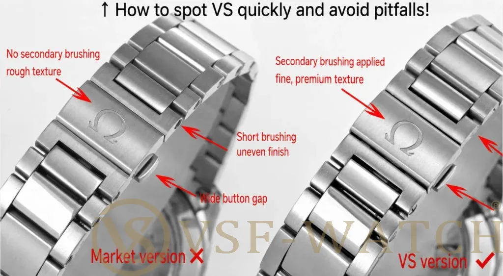
The bracelet brushing on standard versions is coarse and harsh. VSF uses a finer secondary brushing that matches the silky texture of gen Omega steel.
The link screws on standard versions are short, recessed, and uneven. VSF's screws sit flush with the bracelet edge and are consistently machined.
The twin-trigger pushers on the clasp are narrower on VSF, matching gen proportions. Standard versions use wider pushers that feel clunkier to operate. The actuation on VSF's clasp is smoother.
| Feature | VSF Watch Aqua Terra | Standard market versions |
|---|---|---|
| Case thickness | 12.8mm (matches gen) | 13.6mm (decorative plates add height) |
| Movement | Integrated 8500/8900 clone, functional shock absorber | Decorated base movement, fake shock unit |
| Balance wheel | Large black, 6 o'clock position | Small gold, 7 o'clock position |
| Dial grooves | Fine, delicate teak lines, warm ivory base | Rough, wide grooves, greyish base |
| Red "Seamaster" logo | Deep, rich red | Bright, fluorescent red |
| Date window | Laser-cut, clean edges | Rough edges, visible burrs |
| Hand chamfering | Secondary chamfering on tails, sharp lume slots | Flat cut, rounded lume slots |
| Bracelet brushing | Fine secondary brushing, silky texture | Coarse, harsh brushing |
| Clasp pushers | Narrow, smooth actuation | Wide, clunky |
Bottom line: The movement is the main reason the VSF case sits at 12.8mm instead of 13.6mm. The decorative plates on standard versions add real height that changes how the watch wears. The dial, hands, and bracelet differences are things you can see in QC photos: check the balance wheel position through the caseback (black at 6 is VSF, gold at 7 is standard), check the red "Seamaster" logo color (deep red is VSF, bright red is standard), and check the date window edges (clean is VSF, rough is standard).
If you're choosing between VSF and a cheaper Aqua Terra, the 0.8mm thickness difference alone is worth the price gap. The watch sits wrong at 13.6mm. VSF got the dimensions right because they started with the right movement.
VSF Watch Omega Aqua Terra 150m: What Makes It Different fro
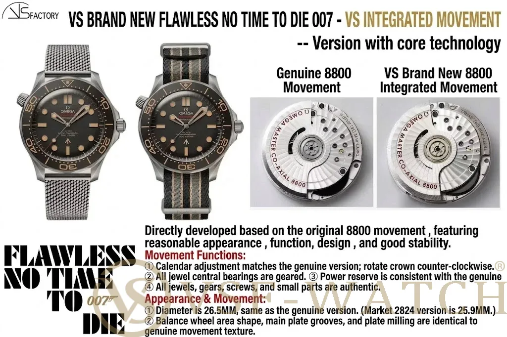 VSF Watch Omega Seamaster 300M 007 NTTD: V4 Titanium Bracele
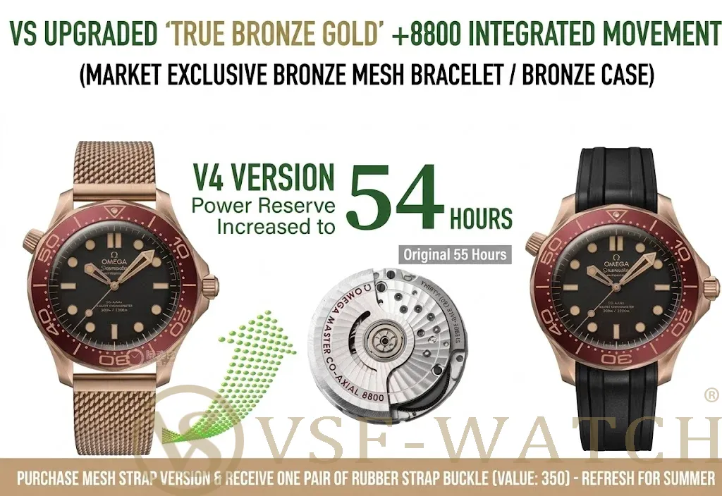 VSF-Watch Omega Seamaster 300M 007 Bronze Gold V4: What the