


Ceramic bezels are standard now on higher-end reps. Scratch-proof, won't fade, holds polish forever. But a one-piece bi-color insert — black on one half, white on the other, no seam — is a different thing entirely. The red/blue and blue/black splits get most of the attention, but the black-and-white "Tai Chi" or "Panda" configuration is actually trickier. One wrong variable in the chemical mix and the white half comes out cloudy, or the black bleeds across the boundary, or the whole ring cracks during sintering. The scrap rate on these is brutal.VSF Watch went through five rounds of prototyping to get their Omega Seamaster Planet Ocean 600m GMT "Tai Chi" bezel to a production-ready state. We got access to their lab images from each phase. Here's what the development cycle looked like, round by round, and what the finished product looks like on the wrist.
Table of contents
Why is a one-piece bi-color ceramic hard
The four failed attempts
The fifth attempt that worked
The finished watch on the wrist
Spec comparison
1. Why is a one-piece bi-color ceramic hard
You can't just glue two halves of different-colored ceramics together. The seam would be visible under any magnification, and the joint is a structural weak point that won't hold up over time. It has to be a single mono-block disc with two distinct color zones, which means the color gets applied during or just after sintering — chemical treatment, electroplating, selective stripping. If the temperature drifts during firing or the chemistry is off by a fraction, the whole batch is scrap.
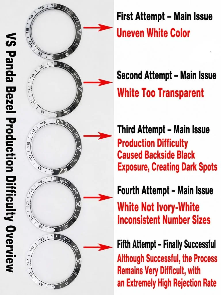
VSF ran into different problems at each stage. Black particle contamination, translucency issues, electrical conductivity failures, color-tone mismatches — all of them showed up at one point or another before they landed on something that matched gen.
2. The four failed attempts
Round 1: Black base, white plating
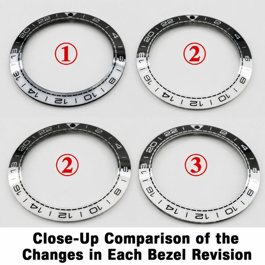
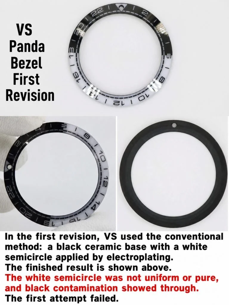
VSF started with a standard black ceramic base disc and tried to electroplate the white half-circle onto it. The white segment came out uneven and riddled with black particle contamination. The boundary between the two colors was messy, with dark specks bleeding into the white zone. Straight to scrap.
Round 2: White base, too translucent
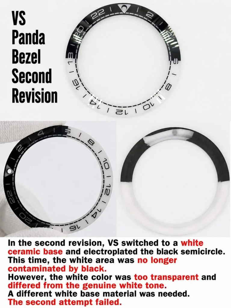
They flipped the approach — white ceramic base, strip the black half. The white stayed clean this time, no black particle bleed. But the white compound itself was too transparent. Under ligh,t it read as a thin, translucent wash rather than the solid milky ivory tone on gen. Back to the drawing board.
Round 3: Denser white, conductivity problems
VSF tried a denser white base material to fix the translucency. It worked for that, but introduced a new problem: the revised chemical matrix had unstable electrical conductivity during processing. Heavy black bleeding, patchy coloration, and dark spots on the back side of the ring. Another batch, another scrap pile.
Round 4: Structure stable, tone and font off
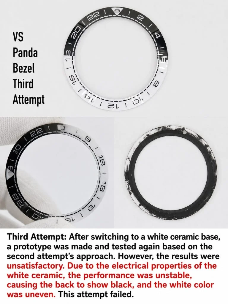
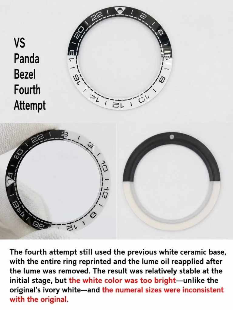
Still on a white ceramic base, VSF applied full-ring electroplating followed by secondary laser stripping and oil-ink masking. The structure finally held — solid bi-color form, no cracking — but the white tone was too bright. Sterile, almost fluorescent, missing the warm ivory undertone that gen has. The 24-hour numerals on the bezel were also inconsistent in size and spacing.
3. The fifth attempt that worked
Round five hit. High-density white ceramic compound with the electrical properties dialed in, then selective electro-stripping of the black half-ring, followed by high-pressure oil-ink painting. The black half came out deep and opaque. The white half landed at the right ivory tone — not translucent like round two, not artificially bright like round four.
The catch: even with the formula figured out, managing these raw ceramic compounds is expensive and touchy. The scrap rate in production is still high, which is why supply of this reference stays spotty. If VSF could pump these out at volume they would, but the process just doesn't scale cleanly.
4. The finished watch on wrist
(Alt Text: Hands-on product review video capture of the VSF Omega Seamaster Planet Ocean GMT Tai Chi on the wrist)
With the bezel sorted, the full watch works. The high-gloss black ZrO₂ ceramic dial face pairs cleanly with the bi-color insert. The color boundary across the 9 and 3 tracks is sharp — no visible line wandering or bleeding under close inspection.
The polished broad-arrow hands and silver GMT pointer are cleanly applied, dial text transfers are crisp. VSF's custom Caliber 8906 movement powers it: true GMT function, about 60 hours of reserve. The case is brushed 316L steel with solid lugs and a matching bracelet. On wrist, it's hefty — the Planet Ocean design is not subtle — but the weight distribution feels right. Not a dress watch, not trying to be one.
5. Spec comparison
| Parameter | VSF V5 | Standard competitors |
|---|---|---|
| Base structure | High-density white ceramic (mono-block) | Painted steel or fused two-piece |
| White tone | Ivory white, opaque | Stark plastic white or translucent |
| Boundary | No bleeding, clean 50/50 | Jagged edges, black particle bleed |
| Bezel font | CNC-milled, proportional numerals | Inconsistent sizing, uneven depth |
Bottom line: VSF burned through four failed bezel prototypes before landing on a process that produced a clean black-and-white mono-block ceramic insert. It's the best version of the Omega Planet Ocean GMT "Tai Chi" out there. If the bezel is the reason you're interested in this reference — and it should be, the bezel is the whole point of this watch — this is the one to get. Just know availability is hit or miss. The scrap rate on these inserts means batches are small and sell through fast.
Tags: #VSF Watch #OmegaSeamaster #PlanetOceanGMT #TaiChiGMT #BiColorCeramic #CeramicBezelManufacturing #SuperCloneReview #WatchHorology #VSFOmega